Welcome to the Functional PRO documentation
Functional Pro Theme is easy to use, but to make your start even faster, we have created this content so that you know the options you have with Functional Pro Theme.
First Steps
These first steps will help you get started faster.
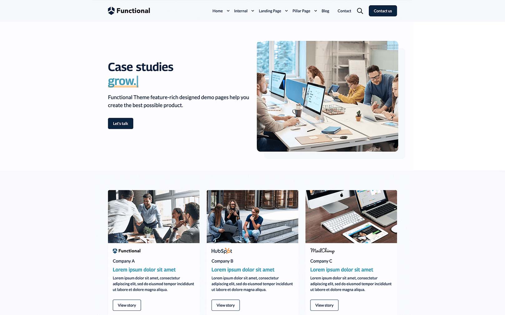
After purchasing the Functional Pro theme, you will find all the Functional PRO templates and modules on
your HubSpot portal.
When creating a new website page or landing page, you can select "Functional Pro" to get a list of all
available templates.
Functional PRO contains a variety of website and landing page templates that serve as a good starting
point for creating well-designed converting inbound websites.
Visit the demo page to see all the sample pages and module configurations that we have created for you.
This documentation helps you get started with the Functional Pro topic, as do the HubSpot documentation
articles in case you're unfamiliar with the basics and usage of the HubSpot CMS.
To better understand the topic, this document also contains a reference guide to custom-coded
Functional Pro modules.
IMPORTANT
We recommend that you set up a version child theme of the Functional Pro theme before you start setting
up and building your site. This will help you or a third party to be able to change the code, extend it with
specific requirements or change styles that cannot be modified at the moment.
To create a child theme see the following HubSpot documentation: Creating a Child Theme.
jQuery Versión
To keep your website up to date and secure we have loaded the latest version of jQuery,
all you need to do is disable the option of the subdomain with which you are going to use the
Functional Pro Theme.
To do so, just follow the steps in the video.
To learn more about how themes work in the CMS and how you can start to creating, you can check out the Hubspot knowledge base:
Setting the theme styles
What you need to configure the theme with the style of your brand
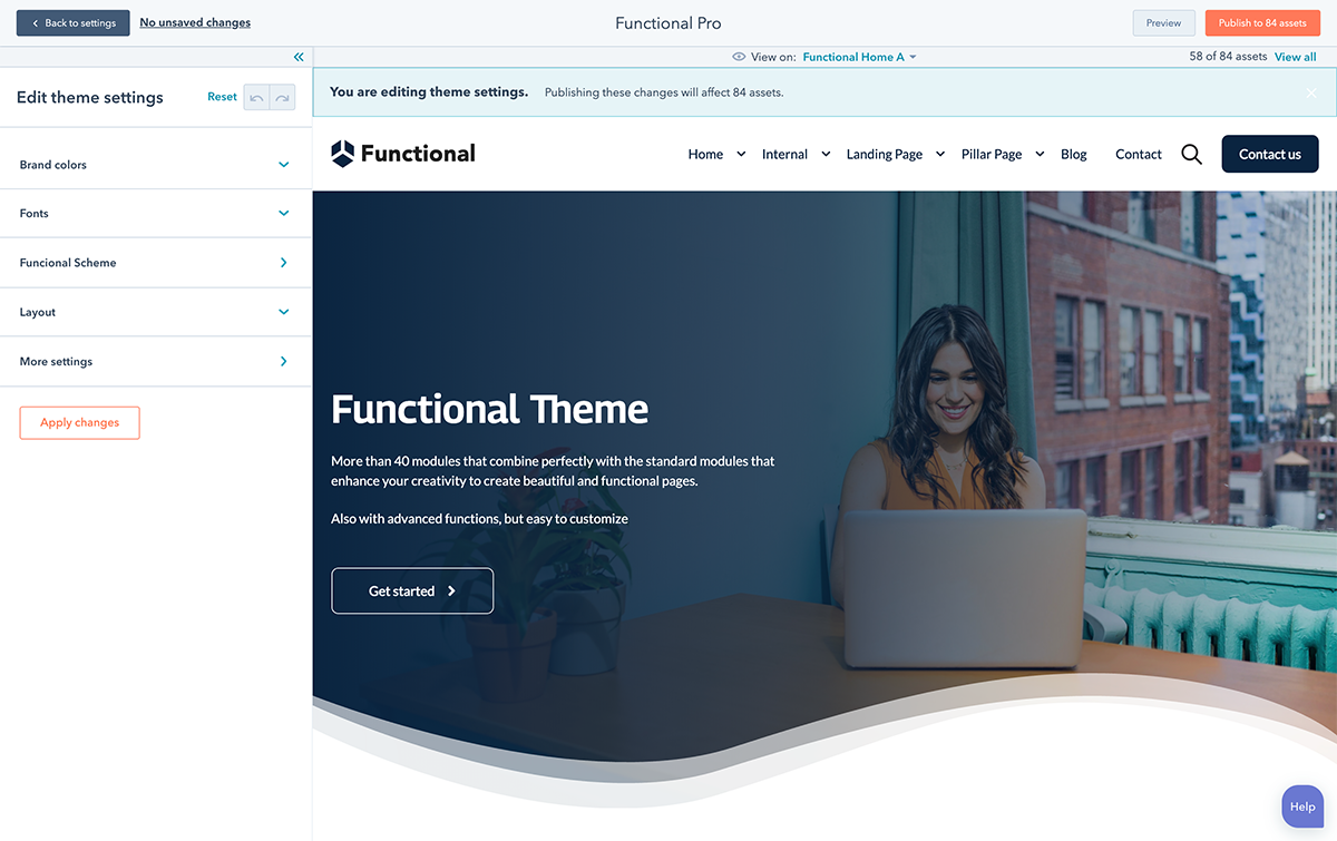
The theme settings allow you to control the global style such as colors, fonts, borders, as well as layout, performance, and some others aspects of styles for Functional Pro modules.
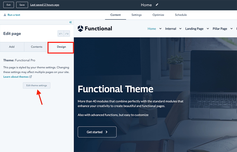
You can access these settings through "Settings"> "Website"> "Themes"> "Functional Pro" or from the design tab of Hubspot´s page editor.
To make it easier to understand the settings, we have included a template called Style Guide, there are the most used elements on a website. To access this and other templates, in the top menu select View in: Style Guide.
In the same way, this option is useful for you to observe how the styles that you have changed are applied in the templates included in Functional Pro.
To learn more about setting up a theme, see de Hubspot documentation:
Your brand colors
In the Functional Pro Theme, we include 2 color blocks, which are used in various templates both for fonts and some element of a module, buttons, among others and colors for the Dark and Light function that can be used in various custom modules as presets.
Brand colors
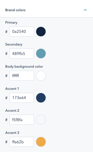
There are 6 colors that change and modify the appearance of the elements included in the Functional Pro Templates, remember that when you change the color scheme, you can see haw some other elements of other templates look like.
Accent colors 1, 2, 3, take the settings from your themes configures in your Hubspot account. in case you do not have them configured, know how to do it in this Hubspot content.
Functional Scheme
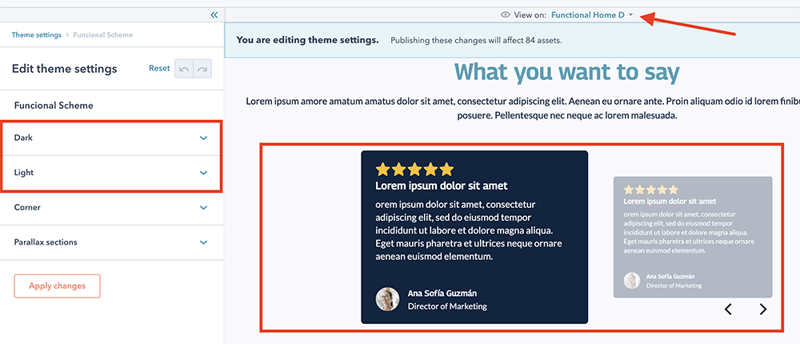
In this block you must configure the background color and the color of the elements such as fonts or icons for Dark and also for Light, there are several templates that use custom modules where you can see that changes.
Note: you can change the color individually in each of the custom modules, if you prefer a different style.
Other Colors
The colors in buttons and forms can be configures individually, as well as in the Functional Theme´s theme settings.
These options area found for buttons: More settings> Buttons for forms More Settings> Forms and Tables: More settings> Tables.
Like the global configuration, each element has individual style options from the page editor, later we will show you how to do it.
Fonts
Configure font families globally and specifically for each typeface.
Base Fonts
Globally you can configure a main source and a secondary source.
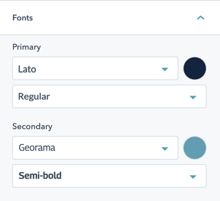
You choose the fonts from the Google Fonts Library, which is natively integrated into de Hubspot CMS.
Typography
To adjust each element used to represent text, you have the following option: More settings> Typography, where you can choose the font family established in your brand identity.
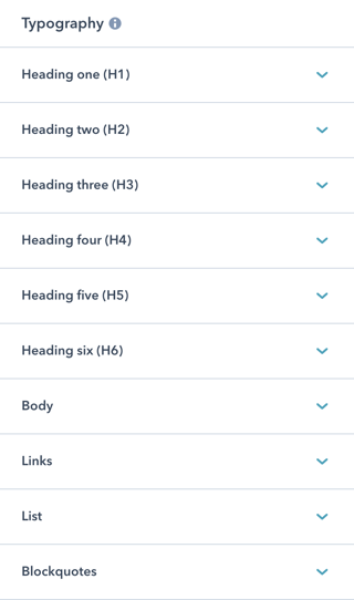
For better readability we have used the following tool: https://type-scale.com/ so, in case you need to change the sizes of the elements, you can do so, preserving the harmony in the design.
In each of the elements you will be able to choose a different font, size and color, as well as 2 more options that will allow you to define the space between lines "line Height" , and the space between letters "Letter Spacing"
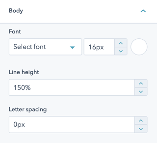
When modifying anu setting, you can view it in any of the available templates. Try and see which one is better, you can always return to the original value stablished in the Theme
Styles
The Functional Pro Theme includes the option to add rounded edges from the global settings to certain elements included in the theme templates.
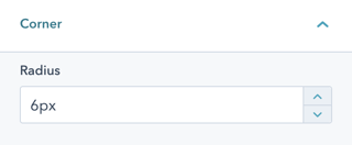
Note: some elements were omitted such as buttons, tables and forms, these elements have the option in their configuration.
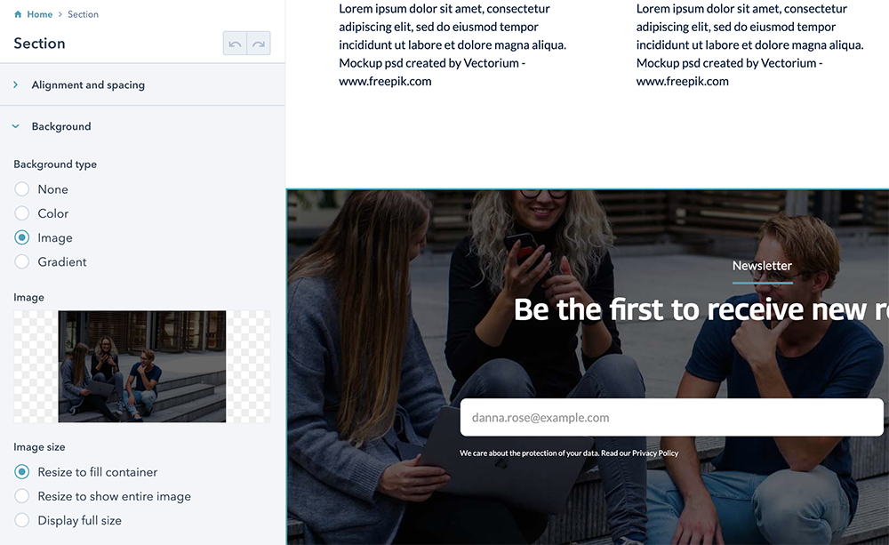
In addition to the rounded edges option, we have configured an option so that the sections where you include a background image, have an effect similar to the Parallax effect, this is done without adding any script, in order to reduce weight.
Important: if you activate this option, the first section of any page that you create will not have this effect.
After activating this option, simply add a background image to any section from the page editor.
Structure
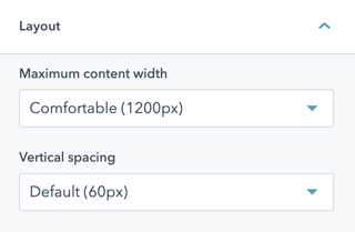
The structure of Functional takes into account two elements, which are the maximum size for elements for which full width and vertical spacing are not set.
These two elements have pre-established values that we consider to be optimal, but if you still want another size, you can choose the "Custom" option in each these options.
Global header and footer
Both, the header and footer of the Functional Pro Theme have styles that you can edit globally.
The configuration is available for the global header: More settings> Website header, and for the Footer in More settings> Website Footer.
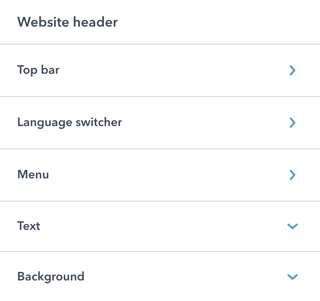
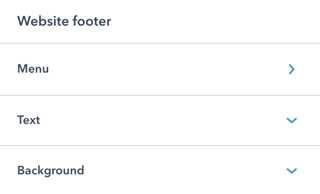
In the global configuration of the theme, you can only change the appearance, for other settings ypu must go directly to the global module.
Global Header
Global footer
In the global header, you must select the menu you want to display and if necessary adjust your logo. We recommend you upload your logo in a SVG format, that makes it have an excellent quality.
To create de menu and learn more, check out the Hubspot guide.
The global footer in Functional Theme is created with drag and drop areas, so, yo can add more elements if you wish, be it logos, a subscription form, among other creative ideas.
The footer has a menu for legals issues, so, you should add only 2 or a maximum of 3 items.
Quick links
In the global header we have added a function to the search engine, they are quick links.

It is a function that we love, but you always have the choice, so in case you do not see it useful, yo can deactivate it, although you will surely love it.
You determine the quick links, so you can add those that you consider relevant, we recommend you no to exceed 4. You can always change them to test.
Custom Modules
Tons of customization
%20(1).png)
Structure of the modules
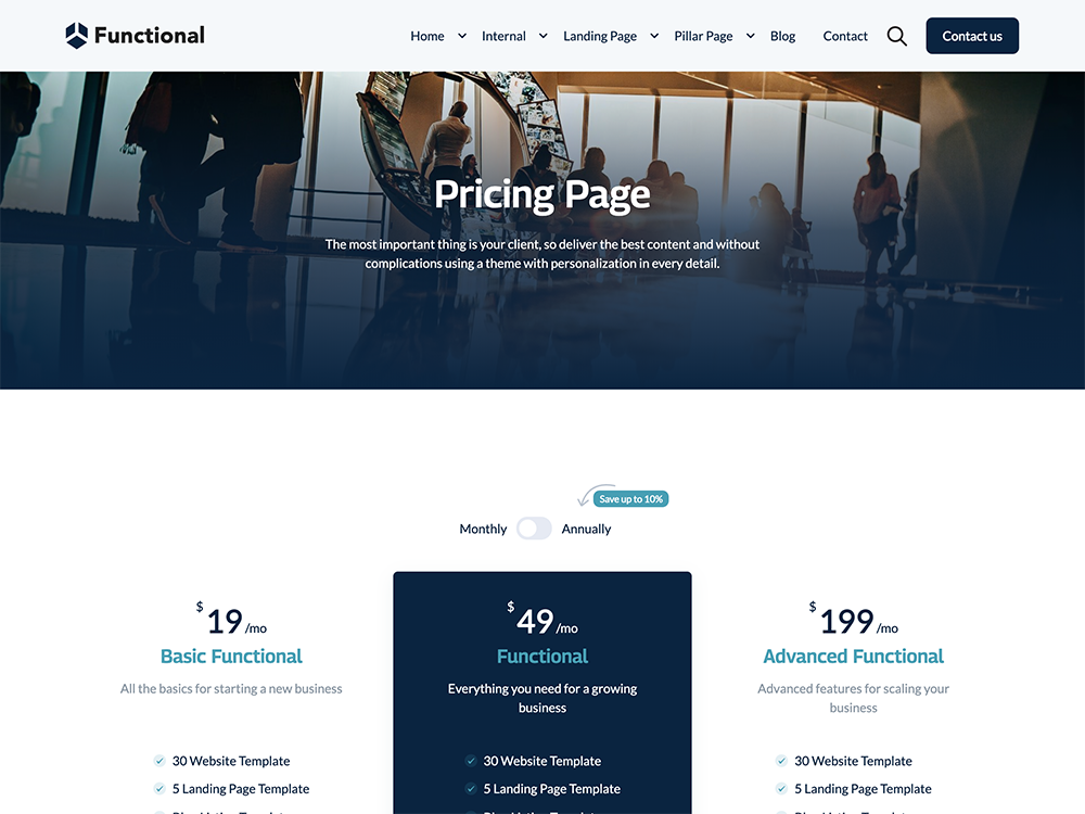
The structure of the modules adapts to the drag and drop functionality of the HubSpot CMS.
The most incredible thing about the Hubspot CMS is the Web Page Builder, which allows content creator and designers to build pages in a very agile and uncomplicated way.
In order to maximize the Hubspot CMS builder, we have created several custom modules which, when combined whit the default modules that exist in the CMS, you can easily create pages that help attract potential customers easily with pillar pages, resources pages, video page, among other options.
All custom modules have two tabs, the content tab and the style tab.
%2022.08.32.png?width=320&name=Captura%20de%20Pantalla%202021-10-19%20a%20la(s)%2022.08.32.png)
Content
In this tab you have all the options related to the content that is displayed.
Some custom modules have in addition to the content, options that in some cases provide a different structure, here is an example:
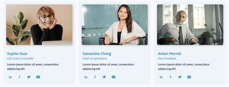
The same module with a different structure.
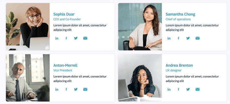
By combining the content tab with the style options, we were able to provide you with more options with the same custom module and in this way, deliver more value to you.
Note: In future updates we will add new structures.

Styles in modules
All custom modules included in Functional Pro use this new option
The styles tab was only available in Hubspot custom modules, now this option is available for custom modules, and for you, to bring an extraordinary experience we have separated the content from the style to give you more customization options, without this implying complexity.
%2022.20.11.png?width=320&name=Captura%20de%20Pantalla%202021-10-19%20a%20la(s)%2022.20.11.png)
Look an example of multiple combinations that are possible thanks to styles:
Note: some adjustments you make, require Apply the style or Refresh de page to see the changes made.
Support
When you buy Functional Pro, you get unlimited email support, so if there is something you cannot do, ask and you will receive a step-by-step video so that everything goes as expected.